老铁记得 转发 ,猫哥会呈现更多 Flutter 好文~~~~
微信群 ducafecat
原文
https://vbacik-10.medium.com/flutter-build-theme-with-abstract-factory-method-e07df8f730e2
代码
https://github.com/VB10/flutter-abstract-theme-manager
参考
正文
最多的应用程序至少创建了一个主题。也许这对于第一个版本来说已经足够了,但是如果这个项目继续增长呢?让我们来看看怎么做。
我们知道项目设计的主题有多重要,所以我们将为项目创建一个主题管理器。让我们创建一个主题管理器以及这个购物页面。
首先,它需要一个页面设计,如也这个页面可以连接到服务。(我为这个示例页面创建了这个端点)
- Background 背景
- App bar - 应用程式栏
- Search Bar - 搜寻栏
— Search Icon ー搜寻图示
— Search Text ー搜寻文字
— Microphone Icon ー麦克风图标
- ListView
— Product Card ー产品卡
- TabBar
— TabBar Icons ー TabBar 图标集
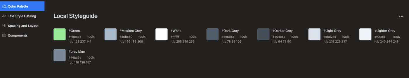
因此,我们需要一个调色板使用这个项目。如果你的设计工具包有一个调色板,你可以在设计工具包中得到所有的颜色。
项目必须在需要新小部件时使用这个调色板。实际上,由于有了主题经理,项目会更容易成长。最后,我们准备好了 Hacking 时间,因此我们将同时使用工厂方法模式和页面原子设计。
Hacking Time
首先,我更喜欢先写核心特性,这就是为什么我们不会在代码完成时加倍工作的原因:
- 使用不同颜色和样式的 ITheme 抽象类
- 用于从一个点管理不同主题的 ThemeFactory 类
工厂设计是创新模式之一。这个模式提供了高级对象,因为客户机什么都不知道。现在,该模式创建了一个自定义对象,以便项目可以使用这个方案。
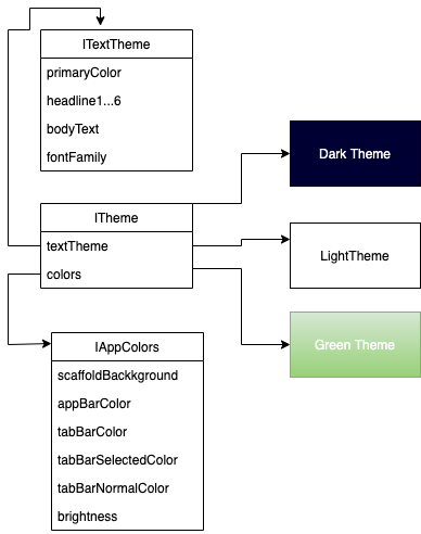
现在我们知道了这个结构需要什么,因为我们可以编写一个同时包含文本和颜色的界面。这个接口提供了一个中心视点,因此项目需要。让我们写下这些要点。
文本主题界面
每个项目都需要这一点,因为大多数用法都指向项目的文本指南。所以我们创建基本样式指南后,非常容易从视图使用。有时我们需要自定义文本样式并不意味着你不使用当前的样式。我们可以使用 copyWith 函数,这样就可以像 headline5 一样使用视图,也可以添加自定义属性,如文本颜色。
1
2
3
4
5
6
7
8
9
10
11
12
13
14
15
16
| abstract class ITextTheme {
final Color? primaryColor;
late final TextTheme data;
TextStyle? headline1;
TextStyle? headline3;
TextStyle? headline4;
TextStyle? headline5;
TextStyle? headline6;
TextStyle? subtitle1;
TextStyle? subtitle2;
TextStyle? bodyText1;
TextStyle? bodyText2;
String? fontFamily;
ITextTheme(this.primaryColor);
}
|
如果您的项目设计有一个工具包,您可以使用 zeplin 工具。这个工具在样式指南选项卡中获取所有的文本样式。
https://zeplin.io/
颜色主题界面
指向项目是非常重要的,因为你知道颜色无处不在。所以我们如何管理更多的项目很容易控制。每个项目都有一个特定的颜色模式,您必须在代码中使用这个模式。如果你不使用模式和项目有一个静态的颜色代码,你不会添加多主题选项,另外你不能管理颜色问题。
1
2
3
4
5
6
7
8
9
10
11
| abstract class IColors {
_AppColors get colors;
Color? scaffoldBackgroundColor;
Color? appBarColor;
Color? tabBarColor;
Color? tabbarSelectedColor;
Color? tabbarNormalColor;
Brightness? brightness;
ColorScheme? colorScheme;
}
|
我说像 paragraph 关于 zeplin。再次你可以使用这个和你能够所有的颜色属性。
Abstract Factory Manager
为多界面创建的管理器。此管理器将为项目创建 ThemeData 实例。由于这个接口,您可以创建一个新的主题实例。这个新的主题只需要一个配色方案等。
1
2
3
4
| abstract class ITheme {
ITextTheme get textTheme;
IColors get colors;
}
|
是的,它看起来很简单,对任何项目都很有用。最后,我们准备使用核心主题绘制操作,因此项目可以声明这个结构的自定义主题。也许,这些主题接口可以改进得更高级。现在对于这个项目来说已经足够了。
最后需要工厂创建者和我们使用这个项目的主题管理器
1
2
3
4
5
6
7
8
9
10
11
12
| abstract class ThemeManager {
static ThemeData craeteTheme(ITheme theme) => ThemeData(
fontFamily: theme.textTheme.fontFamily,
textTheme: theme.textTheme.data,
cardColor: theme.colors.colorScheme?.onSecondary,
floatingActionButtonTheme: FloatingActionButtonThemeData(
foregroundColor: theme.colors.colors.white,
backgroundColor: theme.colors.colors.green),
appBarTheme: AppBarTheme(backgroundColor: theme.colors.appBarColor),
scaffoldBackgroundColor: theme.colors.scaffoldBackgroundColor,
colorScheme: theme.colors.colorScheme);
}
|
我计划只有具体的领域,因为它的项目只有两个页面,因为你知道这个样本。你必须创建文本样式和配色方案区域的其他区域。让我们用这个结构创建自定义主题,我们将展示这种使用优势。
Ligh Theme on Project
实际上,我们有一个结构和项目,如何创建一个轻的主题。
1
2
3
4
5
6
7
8
9
10
11
| class AppThemeLight extends ITheme {
@override
late final ITextTheme textTheme;
AppThemeLight() {
textTheme = TextThemeLight(colors.colors.mediumGrey);
}
@override
IColors get colors => LightColors();
}
|
当然,暗主题创建这样,因此只是改变风格的指导方针和项目可以直接使用。您可以在这里访问黑暗主题代码。
TextTheme Light 需要绘制文本默认颜色的基本颜色,而浅色已经从 zeplin 样式创建。
1
2
3
4
5
6
7
8
9
10
11
12
13
14
15
16
17
18
19
20
21
22
23
24
25
26
27
28
29
30
31
32
33
34
35
36
37
38
39
40
41
42
43
| class TextThemeLight implements ITextTheme {
@override
late final TextTheme data;
@override
TextStyle? bodyText1;
@override
TextStyle? bodyText2;
@override
TextStyle? headline1;
@override
TextStyle? headline3;
@override
TextStyle? headline4;
@override
TextStyle? headline5;
@override
TextStyle? headline6;
@override
TextStyle? subtitle1;
@override
TextStyle? subtitle2;
final Color? primaryColor;
TextThemeLight(this.primaryColor) {
data = TextTheme(
headline6: TextStyle(fontSize: 20, fontWeight: FontWeight.normal),
subtitle1: TextStyle(fontSize: 16.0),
).apply(bodyColor: primaryColor);
fontFamily = GoogleFonts.arvo().fontFamily;
}
@override
String? fontFamily;
}
|
好的,如果我们想看浅色的主题实例,它显示了这一点。
1
2
3
4
5
6
7
8
9
10
11
12
13
14
15
16
17
18
19
20
21
22
23
24
25
26
27
28
29
30
31
32
33
34
35
| class LightColors implements IColors {
@override
final _AppColors colors = _AppColors();
@override
ColorScheme? colorScheme;
@override
Color? appBarColor;
@override
Color? scaffoldBackgroundColor;
@override
Color? tabBarColor;
@override
Color? tabbarNormalColor;
@override
Color? tabbarSelectedColor;
LightColors() {
appBarColor = colors.white;
scaffoldBackgroundColor = colors.white;
tabBarColor = colors.green;
tabbarNormalColor = colors.lighterGrey;
tabbarSelectedColor = colors.darkerGrey;
colorScheme = ColorScheme.light()
.copyWith(onPrimary: colors.green, onSecondary: colors.white);
brightness = Brightness.light;
}
@override
Brightness? brightness;
}
|
有时需要准备风格,因为没有足够的风格知识。这时你可以为你的项目使用一个配色方案实例,这样你就可以得到材质配色方案,因此可以添加你自定义的业务层。
而 Light 主题就是准备使用的。该项目只需要主题工厂方法,您可以编写这个类实例。对于项目颜色的所有内容,这都是可以接受的。
1
2
3
4
5
6
7
8
9
10
| class MyApp extends StatelessWidget {
@override
Widget build(BuildContext context) {
return MaterialApp(
title: '@VB10',
theme: ThemeManager.craeteTheme(AppThemeLight()),
home: SampleView(),
);
}
}
|
是的,我们可以开始在搜索结果屏幕上绘图。特别是不要忘记这个方法,让我们看看如何为这个项目创建一个主题实例。
1
2
3
4
5
6
7
8
9
10
11
12
13
14
15
16
17
| abstract class ThemeManager {
static ThemeData craeteTheme(ITheme theme) => ThemeData(
fontFamily: theme.textTheme.fontFamily,
textTheme: theme.textTheme.data,
cardColor: theme.colors.colorScheme?.onSecondary,
tabBarTheme: TabBarTheme(
indicator: BoxDecoration(),
labelColor: theme.colors.tabbarSelectedColor,
unselectedLabelColor: theme.colors.tabbarNormalColor,
),
floatingActionButtonTheme: FloatingActionButtonThemeData(
foregroundColor: theme.colors.colors.white,
backgroundColor: theme.colors.colors.green),
appBarTheme: AppBarTheme(backgroundColor: theme.colors.appBarColor),
scaffoldBackgroundColor: theme.colors.scaffoldBackgroundColor,
colorScheme: theme.colors.colorScheme);
}
|
现在项目直接依赖于所有的主题实例,因为我们只是改变主题值后,这个项目去一个新的配色方案,另外项目从来不需要任何代码的设计时间。这一点意味着你的项目设计已经完成了所有的工作
Feature Page
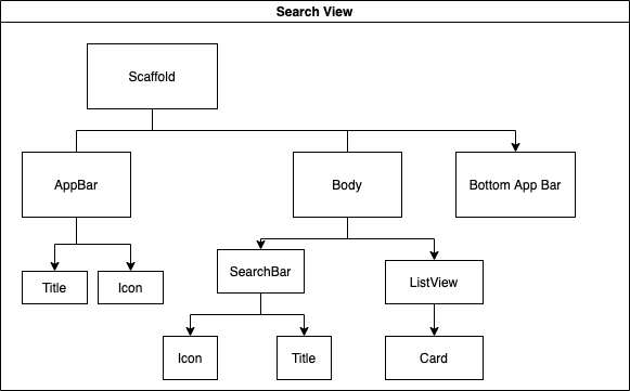
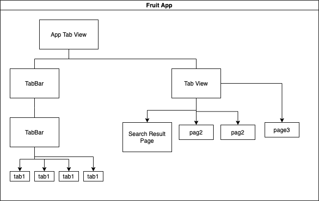
我们有一个主题实例,所以只需调用这个实例,一切就绪。首先,绘制页面树非常重要,更好地理解。
现在编码非常简单,因为我们知道如何绘制这个。特别是您对编码时间非常注意,因此可以在页面设计中始终使用主题实例。该项目有一个主题设计,因为可以直接调用这个变量。例如,任何页面可以需要背景色,所以我们不需要一遍又一遍地写,因为我们有使用这种情况的主题实例。
是的,我们准备开发另外的主题管理器和小部件树结构。首先,让我们在编码中创建一个 tab 视图结构。
1
2
3
4
5
6
7
8
9
10
11
12
13
14
15
16
17
18
19
| final List<MapEntry<Widget, IconData>> _pages = [
MapEntry(SampleView(), Icons.search),
MapEntry(Container(), Icons.search),
MapEntry(Container(), Icons.search),
MapEntry(Container(), Icons.search),
];
@override
Widget build(BuildContext context) {
return DefaultTabController(
length: _pages.length,
child: Scaffold(
floatingActionButtonLocation:
FloatingActionButtonLocation.centerDocked,
floatingActionButton: floatingActionButton(context),
bottomNavigationBar: _bottomAppBar(),
body: TabBarView(children: _pages.map((e) => e.key).toList()),
));
}
|
实际上,我们看到了 fab 按钮,我们需要一个自定义颜色,因为这个颜色是为蓝色创建的,但是我们在主题中添加了这个自定义代码,只写了一个浮动的操作按钮。此按钮从上下文中读取主题实例中的 own 属性。
我说你不需要额外的代码,直接调用这个小部件。
1
2
3
4
5
6
| FloatingActionButton floatingActionButton(BuildContext context) {
return FloatingActionButton(
child: Icon(Icons.add),
onPressed: () {},
);
}
|
之后,让我们显示搜索结果页面设计。我们谈到了这篇页面设计对文章的打击。这对颤振计划非常重要。你需要一直考虑这个树型结构。你可以用这个小部件树的思想做一个很棒的页面。
1
2
3
4
5
6
7
8
9
10
11
12
13
14
15
| @override
Widget build(BuildContext context) {
return Scaffold(
appBar: buildAppBar(context),
body: Padding(
padding: EdgeInsets.only(top: MediaQuery.of(context).size.width * 0.08),
child: Column(
children: [
textFieldSearchCard(context),
Expanded(child: buildGridViewBody()),
],
),
),
);
}
|
这说明了很多问题。让我们来看一些小部件,以了解如何使用主题。我们的设计有一个自定义搜索栏,带有搜索图标和麦克风按钮。
1
2
3
4
5
6
7
8
9
10
11
12
13
14
| Widget textFieldSearch(BuildContext context) {
return TextField(
decoration: InputDecoration(
border: InputBorder.none,
prefixIcon: Icon(Icons.search_sharp,
color: Theme.of(context).colorScheme.onPrimary.withOpacity(0.5)),
suffixIconConstraints: BoxConstraints(maxHeight: 30),
suffixIcon: FloatingActionButton(
onPressed: () {},
mini: true,
child: Icon(Icons.mic_sharp),
)),
);
}
|
这种代码设计不需要额外的代码。您可以从主题上下文中使用这里需要的内容。让我们来看看文本样式示例:
1
2
3
4
5
6
7
8
9
| Text buildTextSub(BuildContext context) {
return Text(
items.searchResults,
style:Theme.of(context).textTheme.headline6?.copyWith(
letterSpacing: -0.2,
fontWeight: FontWeight.w400,
),
);
}
|
你可以看到这是一个非常简单和易于管理的代码,我只是添加了一些自定义代码并完成了所有的工作。
你可以看到条目属性,也许这和注释有重要的关系。如果您拥有所有的常量值类,并且只想创建常量值,那么您可以在类获得安全能力之后添加@immutable 注释。
1
2
3
4
5
| @immutable
class AppTextItems {
final String searchResults = 'Search Results';
final String brocoliText = 'Broccoli';
}
|
是的,这个项目可能是理解这个体系结构的一个样本,但是总是应该编写强大的代码。
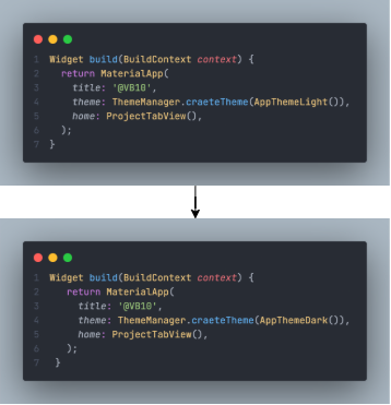
Yees 项目已经完成。如果你想改变一个主题,比如黑暗,我们只需要把这个实例改成黑暗,然后就可以了。
因此,我们采用了抽象的工厂设计能力和可管理的代码设计。它听起来很适合开发力量,因为颤振可以改善模式和特殊的角度。
完成了。现在我们可以直接实施我们自己的项目并管理一切。另一方面,这个项目不需要如何创建新的主题知识,因为你知道我们创建接口。不同的主题刚好适合这些界面,然后一切都完成了。
实际上,本文的主要目标是如何在主题实例中使用这种模式,因此这方面的知识对您的开发生活非常重要。
感谢你阅读《感谢你阅读《为你的生命健康》》
https://github.com/VB10/flutter-abstract-theme-manager
© 猫哥
https://ducafecat.tech/
https://github.com/ducafecat
往期
开源
GetX Quick Start
https://github.com/ducafecat/getx_quick_start
新闻客户端
https://github.com/ducafecat/flutter_learn_news
strapi 手册译文
https://getstrapi.cn
微信讨论群 ducafecat
系列集合
译文
https://ducafecat.tech/categories/%E8%AF%91%E6%96%87/
开源项目
https://ducafecat.tech/categories/%E5%BC%80%E6%BA%90/
Dart 编程语言基础
https://space.bilibili.com/404904528/channel/detail?cid=111585
Flutter 零基础入门
https://space.bilibili.com/404904528/channel/detail?cid=123470
Flutter 实战从零开始 新闻客户端
https://space.bilibili.com/404904528/channel/detail?cid=106755
Flutter 组件开发
https://space.bilibili.com/404904528/channel/detail?cid=144262
Flutter Bloc
https://space.bilibili.com/404904528/channel/detail?cid=177519
Flutter Getx4
https://space.bilibili.com/404904528/channel/detail?cid=177514
Docker Yapi
https://space.bilibili.com/404904528/channel/detail?cid=130578